




Saturday, 15 August 2026 04:00 PM
Company Update
NEW YORK CITY, NY / ACCESS Newswire / August 15, 2026 / The influencer marketing agency's rebrand - designed by studio PRTNRS - turns its "We Turn Mentions into Money" promise into a visual system drawn from banknote engraving, and ships with AI agents that let the team produce brand-consistent content at speed.
Holy Marketing, the full-cycle influencer marketing agency working across the United States and Latin American markets, today unveiled a complete new brand identity. The system was designed by PRTNRS, a design studio specializing in brand systems and AI-powered content workflows.

The rebrand replaces an identity the agency had outgrown. Over the past two years Holy Marketing's client base has shifted toward larger organizations and longer engagements, moving the agency's conversations earlier in the business - from campaign execution toward market entry, creator development, and revenue accountability. The previous visual language, built for a younger and scrappier company, no longer matched the room.
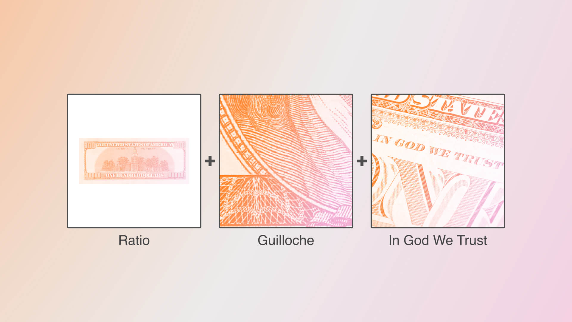
The new identity is built around a single idea drawn from the agency's own name: the point where the sacred and the financial meet in modern culture. The answer the design team landed on was the US dollar bill and the phrase printed on it - In God We Trust. The resulting system reinterprets banknote design language - guilloché patterns, precise linework, compositional rhythm and proportion - as a contemporary brand vocabulary. The logo's halo, a fixture of the previous identity, was removed.
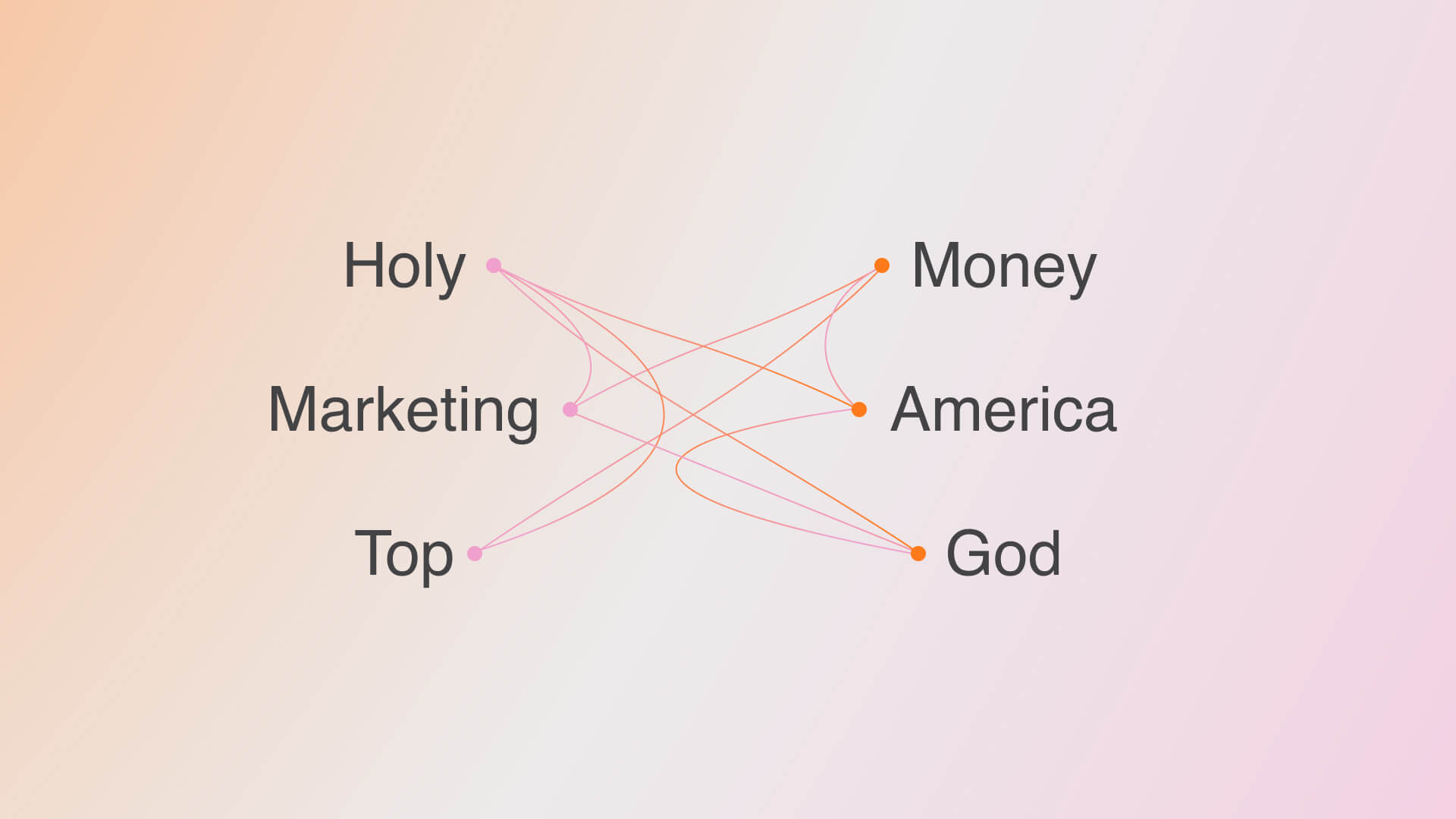
The work also included a full design system and a set of AI agents built on top of it, allowing Holy Marketing's team to produce brand-consistent assets without routing every deliverable through a designer.
Quotes
Kseniia Petrina, Co-Founder and CEO, Holy Marketing:
"We started fourteen years ago in film production in the Dominican Republic. Everything we know about telling a story that actually moves someone came from there. So the brief was never 'make us look new' - it was 'keep what this name has always meant, and carry it into what we've become.' Because we have grown. The agency has grown, and so has the calibre and the seriousness of the clients who come to us. PRTNRS handled that beautifully, and I'm proud to say that a new chapter starts for Holy Marketing today."
Asya Kruglova, Co-Founder and CMO, Holy Marketing:
"In a market where everyone copies everyone, an identity you're genuinely remembered for stops being a nice-to-have and becomes the whole point. We chose PRTNRS because they don't just decorate a brand - they find the idea already living inside it and give it form. With us, they caught something we'd never quite said out loud: 'Holy' sounds soft and comforting, but underneath it we're a growth engine for the brands we work with. Influencer marketing looks like views and awareness at first glance; at the end of the day it's about leads and real revenue, whether the goal is brand or performance. They built that truth right into the visuals - the texture of real paper money now runs through the digital patterns across our website and identity. Obsessive on the small details, never losing the bigger meaning. For us, this rebrand also marks a shift: from a startup voice to the voice of an established community."
Yan Petrin, Co-Founder and Head of Production, Holy Marketing:
"Beyond the identity itself, it mattered to us that our design partner knew how to work with AI properly - as infrastructure, not as a novelty. PRTNRS didn't just hand over files. They built a design system and a set of AI agents on top of it, so our team can produce on-brand assets in hours rather than weeks, without a designer in the loop for every single deliverable. That's a production capability, not a logo. And to be precise about where we draw the line: we use AI to move faster in design and production. We do not use AI-generated creators. The people in our campaigns are real people."
Violeta Markosyan, PRTNRS, on the concept:
"We didn't want to create an identity that merely looked modern; it was crucial for us to find a concept that emerged naturally from the brand itself. The starting point was the name 'Holy Marketing.' We considered where the concepts of the 'sacred' and 'money' intersect in modern culture. The answer was surprisingly obvious: the US dollar bill, bearing the phrase 'In God We Trust.' It embodies the coexistence of faith and money within a single symbol. This parallel aligned perfectly with the agency's philosophy of helping brands transform audience attention into financial results - encapsulated in the slogan 'We Turn Mentions into Money.'
This concept became the foundation of the entire visual system. We reimagined characteristic banknote design elements - such as guilloché patterns, precise linework, compositional rhythm, and proportions - and transformed them into a modern brand language. It is not a literal imitation of currency, but rather a visual metaphor for value, trust, and growth. Thus, the identity reflects both the agency's work with major corporations and its core message: effective marketing is not just about reach and mentions, but a genuine tool for creating business value."
Maria Pavlova, PRTNRS, on the brief:
"Holy Marketing approached us with a request for rebranding due to an expansion of their client base. Their previous visual identity no longer reflected their new positioning. The brand needed to retain its boldness and recognizability while looking more mature, confident, and reputable. The new visual system was designed to address exactly this challenge."
Maria Pavlova, PRTNRS, on the palette:
"We wanted to rethink the existing color palette rather than abandon it completely. We kept the brand's signature orange, which was already strongly associated with Holy Marketing, and expanded it with additional colors. This made the visual system more flexible and allowed it to work effectively across a wide range of formats and applications."
Maria Pavlova, PRTNRS, on what they deliberately avoided:
"We deliberately moved away from the extensive use of illustrations and imagery, focusing instead on clean geometry and graphic design. This approach helped us create a more versatile and timeless visual system. We also removed the halo from the logo, which had been part of the previous identity. Although it had an obvious connection to the name 'Holy,' this technique is too literal and is widely used by brands with similar names. We wanted to find a more original and conceptual way to express the brand idea."
About Holy Marketing
Holy Marketing is a full-cycle influencer marketing agency headquartered in New York, working across the United States and Latin American markets including Mexico, Brazil, Colombia and the Dominican Republic. Founded by Kseniia Petrina, Asya Kruglova and Yan Petrin, the agency covers strategy, creator casting, production, negotiation and performance reporting, with a casting practice rooted in film and television backgrounds. Holy Marketing treats each market as its own - localization by country, not translation by region - and does not use AI-generated creators in its campaigns.
holymarketing.agency · LinkedIn
About PRTNRS
PRTNRS is a design studio working across branding, AI content and web design, helping companies build and scale visual communication - from brand systems to AI-powered content workflows.
https://prtnrs.agency/ · Linkedin
Media Contact
[email protected]
SOURCE: Holy Marketing